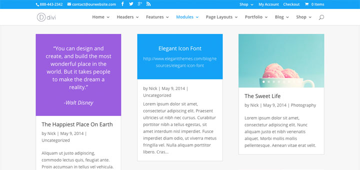
Responsive Web Design

An ever increasing proportion of your users are browsing the web on mobile devices. A responsive web design will make sure your website is legible on all those devices, no matter the size of the screen. The layout “responds” to the device screen size, changing the number of columns and font-size to suit the screen.
An example of how a responsive web design displays on different screens:
Smart Phone
- Single column layout
- 24pt headings
- 14pt text
- Popup navigation menu
Tablet
- Two column layout
- 28pt headings
- 15pt text
- Popup navigation menu
Laptop
- 4 column layout
- 32pt headings
- 16pt text
- Dropdown navigation menu
Desktop
- 4 column layout
- 40pt headings
- 16pt text
- Dropdown navigation menu
The look and feel of a CMS website is determined by the theme, which is a collection of templates, images and stylesheets which are used to display the site content from the database. A responsive theme applies a mobile-friendly design across a CMS site. Professionally designed responsive themes can be purchased off-the-shelf for each content management system – there are many hundreds available. A purchased theme can then be customised to match your site’s branding using logos, site colours, typefaces, photography etc.
Another approach is to custom build a theme from a suitable responsive base theme. Base themes are highly configurable themes that have many useful responsive features built-in, such as breakpoints and font-resizing, and have the ability to display in a graceful (if limited) form on older browsers.
Find Out More
Moot Point offers expert responsive theme design for your content management system. Get in touch to find out how a mobile-friendly design can help your business reach a broader audience.
Recent Responsive Design Projects

Ardea International
WordPress redesign with custom theme in Foundation framework with many custom post types and templates. Membership system and monetised content management.

SEM Careers
WordPress recruitment site using custom post types for job listings and custom web forms for online applications.
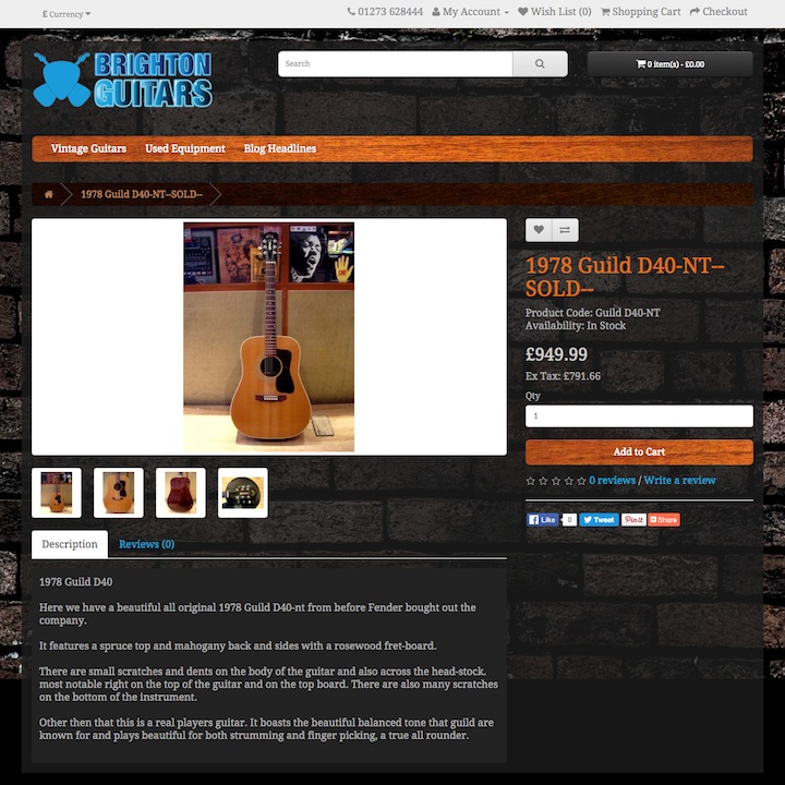
Brighton Guitars
Ecommerce site build in OpenCart with custom-built theme and integration with EPOS system.