
Responsive Design
A responsive theme design displays your website elegantly on different screen sizes. A responsive or mobile-friendly theme “responds” to the browser’s display size to lay out the content legibly for that size. For example, a responsive site may display the content in 4 columns on a desktop, 2 columns on a tablet and a single column on smart phones. Font sizes are often increased for smaller displays to increase legibility. On mobile screens, the navigation menu is often folded into a single drop-down menu to save screen real estate.
With so many people now browsing the web on mobile devices, a responsive theme design is essential to cater for this growing proportion of your customers. In addition, Google now gives a boost to mobile-friendly sites in their search rankings.
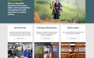
Ardea International
WordPress redesign with custom theme in Foundation framework with many custom post types and templates. Membership system and monetised content management.
Tags: custom post types, membership system, monetised content, responsive design, theme build, wordpress

SEM Careers
WordPress recruitment site using custom post types for job listings and custom web forms for online applications.
Tags: custom post types, gravity forms, responsive design, wordpress
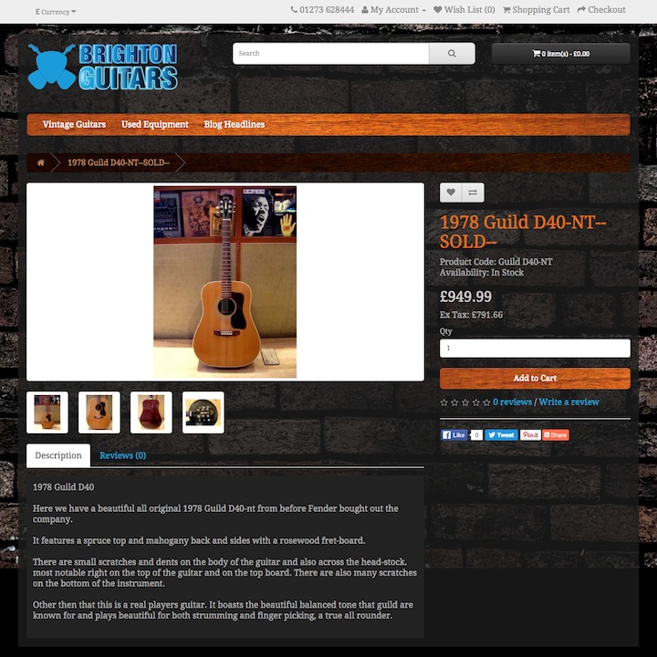
Brighton Guitars
Ecommerce site build in OpenCart with custom-built theme and integration with EPOS system.
Tags: data integration, ecommerce site build, opencart, responsive design, technical seo, theme design
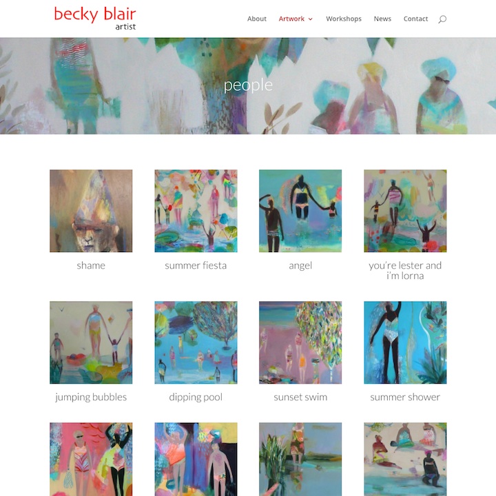
Becky Blair Artist
Responsive portfolio site built in WordPress with extensive use of custom post types and templates.
Tags: custom post types, gravity forms, responsive design, theme design, wordpress
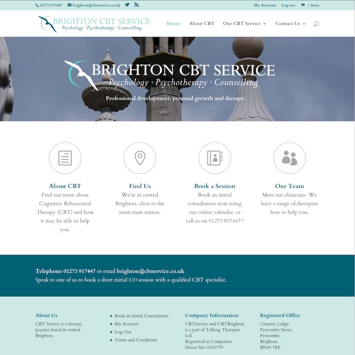
CBT Service
WordPress build with WooCommerce booking system and Xero accounting system integration.
Tags: booking system, data integration, ecommerce site build, payment gateway, responsive design, woocommerce, wordpress
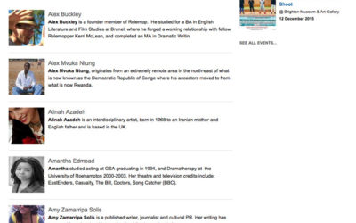
ART:sync
Conversion of existing Drupal 6 site to Drupal 7 with custom-built responsive theme.
Tags: data migration, drupal, responsive design, upgrade
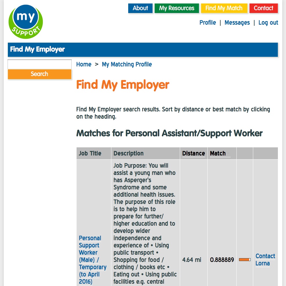
WECIL My Support
Secure job search portal built in Drupal 7 with custom profile matching and location-based search.
Tags: accessible design, custom module development, data integration, drupal, location search, membership system, responsive design
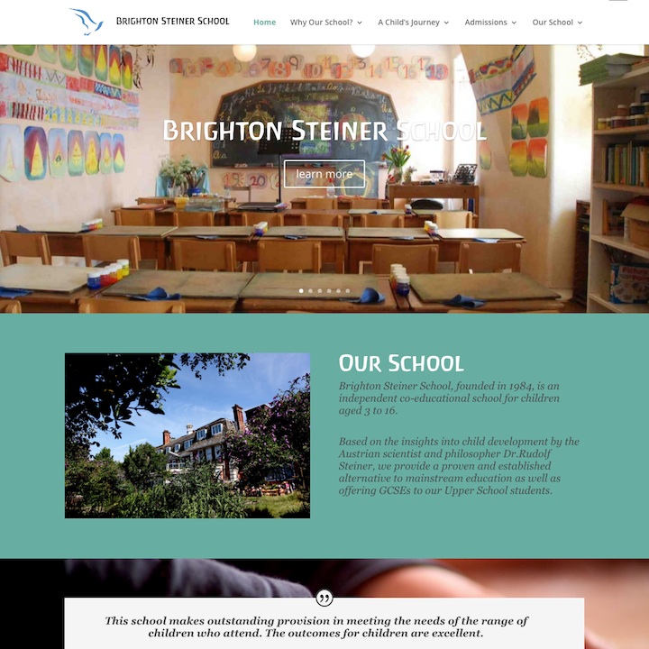
Brighton Steiner School
Responsive school website built in WordPress with event management and online application forms.
Tags: event management, gravity forms, responsive design, wordpress
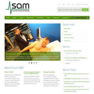
Society for Acute Medicine
Responsive WordPress site build with tiered membership system and member directory using custom post types.
Tags: custom module development, custom post types, membership system, responsive design, wordpress